
Wovex Insight
The Golden Thread
There is a fascinating theme in the book ‘Spark Joy’, by Marie Kondo that recommends you only keep things at home that ‘spark joy’. Decluttering and organising your home might not be for everyone, but she has a point.
Have you ever wondered if you ‘spark joy’ in the heart of your employer or colleagues with your projects? Maybe not. However, even in your work life, when projects are reviewed for value, the idea of ‘sparking joy’ may not be a bad one.
Imagine doing the right projects, that add real value, which you can easily explain when someone asks. Now that would give clarity, and you would feel more confident in projects and the value you expect from them. When you justify projects based on their value, it causes those projects that are essential to success, to rise-up and survive.
Justifying project value is hard, and understanding their value should be easier. It is why organisations have too many projects, and why prioritising makes sense.
Projects are what organisations use to meet strategic objectives. But then, they do use up resources, and resources are in short supply, so you cannot do everything.
If you are able to prioritise the most value-adding projects, then do. Why would anyone waste time, effort and resources on something unimportant at the expense of the important?
The challenge is knowing that projects are making a meaningful and valuable difference.
So how do you know what a project offers the organisation in terms of value? Sure, the financial and non-financial benefits need to be worth the cost. But you are missing an important point. How does that demonstrate that the project is helping the organisation meet important objectives? How can we share this visually so people can see each projects’ strategic contribution?
Seeing the Golden Thread
All organisations need to know what their ‘Golden Threads’ are. Showing how projects connect to and help make the big important results happen. A project may not return lots of money, for example, but it may contribute to making something less tangible but equally important happen for the organisation. Now that is worth knowing.
Unlike general statements about why a project is good, showing alignment to specific objectives is one of the rare ways to demonstrate the strategic value of every type tangibly.
Time for an example of benefits mapping to see the thread visually:
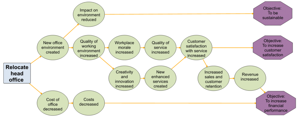
Figure 1: Example of how a project is expected to contribute to three objectives.
Well, here you can see a cause and effect relationship, from a project to the objectives, that makes sense. It is logical. See how the project to relocate the head office (square) is expected to contribute to three strategic objectives (hexagons). The benefits expected as a result of the project (circles) are shown, giving a view of how small changes build to impact objectives.
One golden thread is the path from the project to the objective ‘To increase satisfied customers’. Another is from the project to the objective ‘To improve the planet’ and the third to the objective ‘To increase financial performance’.
Without seeing these ‘golden threads’, the following is more typical.
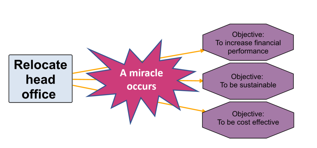
Figure 2: How a project is expected to contribute to three objectives is not clear.
It does not make sense. It is not logical but all too common in business cases. Which if you included these pictures in a business case, would they help you get approval? Not hard to imagine.
Value of the Golden Thread
Seeing and explaining this continuous ‘thread’ of connection is truly as valuable as gold.
Every project should be able to demonstrate the story of its purpose, how the project impacts objectives.
What we have then is a line of sight from project to objective, a clear path from project to strategic success. Organisations can assess and select projects, based on strategic alignment in a way that is transparent and more easily agreed collectively (even at a distance).
You get the idea.
Benefit maps that show these golden threads are easy and straightforward to create. This is important because the idea of creating maps does not get many people excited. But the results often give people a taste for mapping. I must confess, I have created hundreds of benefit maps, and I love it. In a sad reflection of myself, it really does spark joy for me.
There are other more detailed ways to prioritise: numerical analysis (for example, linear programming) and simulations. But I would advise extreme caution, the more complex your analysis, the more risk there is of errors and effort needed increases. If the approach is complex, the golden thread cannot be so easily seen by everyone. Choose the level of accuracy and precision carefully for any approach you take, that you will be able to sustain the effort long-term and that it offers you a golden thread that everyone can follow joyfully.
When Things Get Big and Scary
A simple map is all well and good when dealing with one project, but eventually, you are likely to need what can be called a portfolio benefits map for insight across all your projects. And that is what all good organisations need to select only the projects that ‘spark joy’.
It is amazing what you can see with a portfolio map. At first, you may wonder why you have so many projects clustered to one objective, or why one objective has so few projects contributing to it. And that is what the golden thread will help you see, valuable insights to help prioritise projects.
Of course, over time, priorities will shift, and projects will change, and you will need to review the map to make prioritisation decisions. With a portfolio map, you have something to work with that already exists, and just needs updating. You do not have to start from scratch each time.
Create a Portfolio Benefits Map (with golden threads)
And this brings me to how to make this happen and create a portfolio benefits map? A logical six-step process.
-
- Add the key ingredients: Add initiatives/projects, benefits and objectives they contribute to. Discuss, prioritise, refine.
- Add relationships: Add the threads that make sense. Discuss, prioritise, refine.
- Add data: Optionally add relative percentage weightings to contribution lines.
- Evaluate, select, prioritise, optimise: To have just the projects you need.
- Get set to manage: Set up measures to track with targets for each.
- Go! Manage realisation and the risk to benefits. Get and share insights.
Now, though this may seem like a lot of data to gather, where is it best to start?
Pressure, complexity and confusion around the priority and value of projects are ever-present. Something different is needed to make use of this new-found clarity. These maps can act as the foundation to drive the realisation of greater benefits.
This is where using a good benefits management software takes the challenge out of managing benefits and gives you a best practice framework to deliver more. Benefits Management software needs to support your discussions of value and helps you to keep refining the story until something beautiful emerges.
Use a portfolio benefits map to show the threads that guide you to do the right projects, which adds real value and can be explained easily when someone asks. And you will have greater clarity and feel more confident about the projects and benefits expected. You will be able to justify the value of projects better and ensure that they are focused on delivering strategic value.
To prioritise, select and maintain the projects that ‘spark joy’ and deliver the financial and non-financial value needed, it is critical for everyone to understand the ‘golden thread’ to your objectives and maps make this easier.
Benefit management systems should help you to take control of benefits in this way and hopefully even bring a bit of extra joy for yourself and your colleagues.